十月知识记录

最近做镇魔曲手游项目,对做项目及注重交互又有了深一层的了解。这里学习并记录几个技能点,方便以后开发。
一、水波纹交互效果
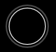
鼠标交互效果:鼠标滑上去时出现水波纹由内往外扩张并逐渐消失。那这个效果是怎么实现的呢。
<div class="skill-slide">
   <a href="javascript:;"></a>
</div>
.skill-slide a{
    width:70px;
    height:70px;
    border-radius: 50%;
    border:2px solid #ccc;
    margin:50px;
    display:block;
    .hvr-ripple-out-hover();
    .transition(all .2s ease 0s);
}
.hvr-ripple-out-hover() {
    display: inline-block;
    vertical-align: middle;
    -webkit-transform: translateZ(0);
    transform: translateZ(0);
    box-shadow: 0 0 1px rgba(0, 0, 0, 0);
    -webkit-backface-visibility: hidden;
    backface-visibility: hidden;
    -moz-osx-font-smoothing: grayscale;
    position: relative;
    &:before {
        content: '';
        position: absolute;
        border: #e1e1e1 solid 3px;
        display: none\9;
        border-width: 0px\9;
        top: 0;
        right: 0;
        bottom: 0;
        left: 0;
        border-radius: 50%;
        -webkit-animation-duration: 1s;
        animation-duration: 1s;
        animation-iteration-count: infinite;
        -webkit-animation-iteration-count: infinite;
    }
    &:hover:before,
    &:focus:before,
    &:active:before {
        -webkit-animation-name: hvr-ripple-out;
        animation-name: hvr-ripple-out;
    }
}

@-webkit-keyframes hvr-ripple-out {
    100% {
        top: -12px;
        right: -12px;
        bottom: -12px;
        left: -12px;
        opacity: 0;
    }
}

@keyframes hvr-ripple-out {
    100% {
        top: -12px;
        right: -12px;
        bottom: -12px;
        left: -12px;
        opacity: 0;
    }
}
二、按钮手推门交互效果

鼠标交互:鼠标移上去时,橙黄色背景从左往右推进,鼠标移出来时橙黄色背景则缩回去。
效果点击 http://zm.163.com/
<div class="cBtn">
  <a href="http://zm.16163.com/" target="_blank">官方论坛</a>
  <div class="cBtn-ove">
      <div class="cBtn-hover">
         <a href="http://zm.16163.com/" target="_blank">官方论坛</a>
      </div>
  </div>
</div>
第一个a标签则是静态时我们看到的。下面再建一个盒子用以放置鼠标移上去后的效果。初始 width:0; 鼠标经过 width:100%; 动画而成。
.cBtn(@fSize,@width,@height,@lHeight,@bColor,@aColor) {
    position:absolute;
    text-align: center;
    border:1px solid @bColor;
    width:@width;
    height:@height;
    //text-indent:@tIndent;
    line-height:@lHeight;
    font-size:@fSize;
    //background:@BbgUrl;
    //background-position:@BbgPos;
    cursor:pointer;
    a {
        display:block;
        color:@bColor;
        &:hover{
            text-decoration: none;
        }
    }

    &:hover {
        .cBtn-ove {
            width:100%;
        }
    }

    .cBtn-ove {
        position:absolute;
        top:0px;
        left:0px;
        width:0;
        height:@height;
        overflow:hidden;
        .transition(width .5s ease);
        .cBtn-hover {
            width:@width;
            height:@height;
            //text-indent:@tIndent;
            line-height:@lHeight;
            border:1px solid @bColor;
            font-size:@fSize;
            //background:@BbgUrl;
            //background-position:@AbgPos;
            background-color:@bColor;
            a {
                display:block;
                color:@aColor;
                text-decoration: none;
            }
        }
    }
}
手机阅读请扫描下方二维码:
上一篇:再聊PC页面适配
下一篇:Why We Chose Vue.js
12345678


1
555
555
555
1
1
1
1
1
1
1
1
1
1
12345678


555
555
555
12345678


12345678


12345678


12345678


1
12345678


zgoqydyqewxgzhvpqsmn
12345678


1


1


1


1


1


1


1


1


1


1
1
555
1
555
1
1
1
1
1
1


1


1
555
1
1
555
1
555
1
1
1
1
1
1
1
1
1
1
1
1
1
1
1
1
1
1
1
1
1
1