flexbox布局实践2

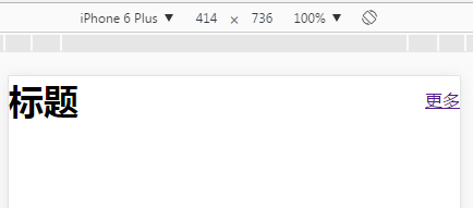
1、两端对齐垂直居中
这种布局常用于头部
header{
  display:flex;
  justify-content:space-between;
  align-items:center;
}
完整代码:
<!DOCTYPE html>
<html>
<head>
  <meta charset="utf-8">
  <meta name="viewport" content="width=device-width">
  <title>test1</title>
  <style>
    body{
      margin:0
    }
    h1{
      margin:0;
    }
    header{
      display:flex;
      justify-content:space-between;
      align-items:center;
    }
  </style>
</head>
<body>
<header>
  <h1>标题</h1>
  <a href="">更多</a>
</header>
</body>
</html>
2、水平垂直居中
宽高固定容器里的垂直居中
header{
  display:flex;
  justify-content:center;
  align-items:center;
}
完整代码:
<!DOCTYPE html>
<html>
<head>
  <meta charset="utf-8">
  <meta name="viewport" content="width=device-width">
  <title>test2</title>
  <style>
    body{
      margin:0
    }
    h1{
      margin:0;
    }
    header{
      height:200px;
      background:red;
      display:flex;
      justify-content:center;
      align-items:center;
    }
  </style>
</head>
<body>
<header>
  <h1>标题</h1>
</header>
</body>
</html>

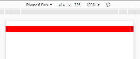
3、子元素横向排列,超过父容器宽度不换行
这种布局常用来做slider
ul{
  display:flex;
}
li{
  flex-shrink:0;
}
完整代码:
<!DOCTYPE html>
<html>
<head>
  <meta charset="utf-8">
  <meta name="viewport" content="width=device-width">
  <title>test3</title>
  <style>
    body{
      margin:0
    }
    ul{
      display:flex;
      padding:0;
    }
    li{
      width:100%;
      background:red;
      margin:0;
      list-style:none;
      height:20px;
      flex-shrink:0;
    }
  </style>
</head>
<body>
<ul>
  <li>1</li>
  <li>2</li>
  <li>3</li>
</ul>
</body>
</html>
手机阅读请扫描下方二维码:
12345678


12345678

12345678
1
12345678
12345678
12345678
12345678
555
555
555
555
555
555
12345678


12345678


12345678
12345678
12345678
1
1
1
1
1
1
1
1
1
1
1
12345678


12345678
12345678
12345678
12345678
12345678


1
12345678


1
12345678


12345678


12345678


12345678


1


1


1


1


1


1
1


1


555
1


1


1
1
555
1
555
1
1
1
1
1
1
1


1
1


1
555
1
1
555
1
555
1
1
1
1
1
1
1
1
1
1
1
1
1
1
1
1
1
1
1
1
1
1