横屏页面注意事项

最近做了一个全横屏的页面—— 劲舞团移动官网
分享一些要注意的地方。
1、根节点字体
当前我们移动端的根节点的字体大小是312.5%, 即16px*3.125=50px,此时编写css时,1rem=50px,网页100%宽度为7.5rem(375px/50)。我们是以屏幕的宽度为基准来计算的,可以用媒体查询来控制不同屏幕尺寸下的根节点字体大小,但是横屏时在部分手机上,媒体查询的高度和宽度仍然是以长的一边为高短的一边为宽,所以媒体查询失效。我们需要用js去控制根节点字体大小;
    if(window.orientation==90||window.orientation==-90){//横屏下
             var h = document.documentElement.clientHeight;
             document.documentElement.style.fontSize=(h)/375*312.5+"%";
      }else{//竖屏下
          var w =document.documentElement.clientWidth;
          document.documentElement.style.fontSize=(w)/375*312.5+"%";

             }
2、强制竖屏时,与横屏时保持效果一致
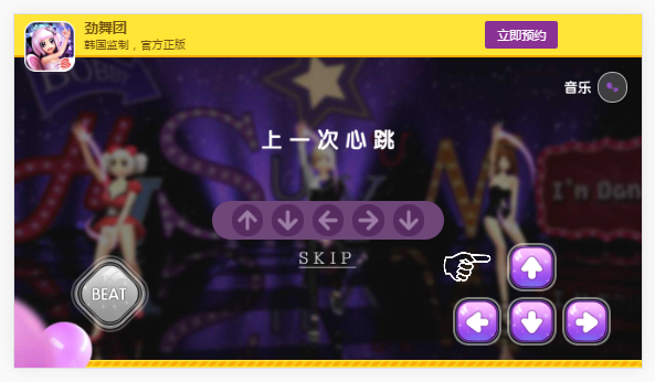
横屏时效果如下:
在强制竖时,要与横屏时效果一致,我们将body旋转90度如下:
    if(window.orientation==90||window.orientation==-90){//横屏下
           document.body.style.cssText="transform: rotate(0deg);"
             var h = document.documentElement.clientHeight;
             var w =document.documentElement.clientWidth;
             document.documentElement.style.fontSize=(h)/375*312.5+"%";
        }else{//竖屏下
              document.body.style.cssText="transform: rotate(90deg);";
              var h = document.documentElement.clientHeight;
              var w =document.documentElement.clientWidth;
              document.documentElement.style.fontSize=(w)/375*312.5+"%";
        }
结果如下:
原因是我们在设置样式的时候设置为
body,html{
    width:100%;
    height:100%;
}
它们的宽度实际上是按屏幕方向来取的,这时我们取得的宽度与高度是相反的,所以后面依赖于百分比的样式全部是错的了。所以在我们并不能这样来设置样式,也通过js来判断屏幕方向来获取最外层body的宽高:
if(window.orientation==90||window.orientation==-90){//横屏下
    document.body.style.cssText="transform: rotate(0deg);"
      var h = document.documentElement.clientHeight;
      var w =document.documentElement.clientWidth;
      document.documentElement.style.fontSize=(h)/375*312.5+"%";
      document.getElementsByTagName("body")[0].style.width=w+"px";
      document.getElementsByTagName("body")[0].style.height=h+"px";

  }else{//竖屏下
        document.body.style.cssText="transform: rotate(90deg);";
         var h = document.documentElement.clientHeight;
        var w =document.documentElement.clientWidth;
        document.documentElement.style.fontSize=(w)/375*312.5+"%";
        document.getElementsByTagName("body")[0].style.width=h+"px";
        document.getElementsByTagName("body")[0].style.height=w+"px";
  }
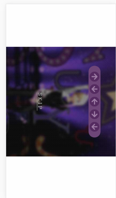
这次我们得到的竖屏下的页面如下图所示:
哎呀,旋转好像出错了,是因为我们在旋转时是按横屏下的中心点为旋转中心来进行旋转的,而屏幕自身的横竖屏切换旋转是以左上角为中心旋转的,旋转中心不重合,所以页面只能看到一部分。我们用绝对定位将body定位到屏幕正中。
if(window.orientation==90||window.orientation==-90){//横屏下
     document.body.style.cssText="transform: rotate(0deg);"
      var h = document.documentElement.clientHeight;
      var w =document.documentElement.clientWidth;
      document.documentElement.style.fontSize=(h)/375*312.5+"%";
      document.getElementsByTagName("body")[0].style.width=w+"px";
      document.getElementsByTagName("body")[0].style.height=h+"px";
      document.getElementsByTagName("body")[0].style.position="static";

  }else{//竖屏下
        document.body.style.cssText="transform: rotate(90deg);transform-origin:center center";
         var h = document.documentElement.clientHeight;
        var w =document.documentElement.clientWidth;
        document.documentElement.style.fontSize=(w)/375*312.5+"%";
        document.getElementsByTagName("body")[0].style.width=h+"px";
        document.getElementsByTagName("body")[0].style.height=w+"px";
        document.getElementsByTagName("body")[0].style.position="absolute";

      document.getElementsByTagName("body")[0].style.left="50%";
      document.getElementsByTagName("body")[0].style.top="50%";
      document.getElementsByTagName("body")[0].style.marginLeft=(0-h/2)+"px";

      document.getElementsByTagName("body")[0].style.marginTop=(0-w/2)+"px";
  }
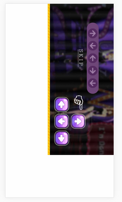
现在再看横竖屏时就一样啦。
手机阅读请扫描下方二维码:
上一篇:React组件间通信
下一篇:JavaScript观察者模式的运用
1
555
1
1
1
1
1
1
1
1
1
1
1
1
12345678


555
555
555
12345678


expr 874125120 + 934038520
12345678


12345678


12345678


1


1


1


1


1


1


1


1


1


1


1


1


1


1


1


1
1
555
1
555
1
1
1
1
1


1


1
555
1
1
1
1
1
1
1
1
1
1
1
1
1
1
1
1
1
1
1